Bedding · Materials · Design
Layering Texture in Western-Inspired Bedding: Plaid, Chenille, and Leather Accents
A bed can feel like a landscape in miniature: a field of pattern, a soft rise of fabric, a few darker details that give the whole scene definition. In Western-inspired bedding, wool plaid, chenille, and leather accents bring different kinds of texture together. The art is in letting each material contribute without allowing any one of them to take over.
A room shaped by touch
Texture is often noticed before it is named. A plaid cover catches the eye with crossing lines and blocks of color. Chenille invites a closer look through its soft, slightly raised surface. Leather introduces a smoother, firmer contrast, catching light differently from the fabric around it. Together, these materials can give a bedroom warmth and character while keeping the bed practical enough for everyday life.
Western-inspired bedding draws on a visual vocabulary associated with rugged landscapes, durable materials, and layered color. That does not require a room to become a themed set. A restrained palette, a few carefully repeated details, and a mix of tactile surfaces can suggest the influence without crowding the space. The result can feel grounded and welcoming rather than theatrical.
Wooded River ensembles offer examples of this approach. The Kinsale Oxford Value Set pairs wool plaid with warm faux-leather accents and toggles, while the Spearhead Dusk Value Set uses a soft chenille surface with faux-leather details and authentic leather fringes. Gallop Claret takes a different route, combining a plush chenille duvet cover with leather accents on its decorative pillows. Each set illustrates how a material can establish a mood and how contrasting details can give that mood shape.
Begin with the largest surface
The bed is usually the room’s broadest upholstered or textile surface, so its main cover sets the visual rhythm. Before adding accent pillows or throws, consider what the duvet cover or coverlet is already doing. A bold plaid has a strong pattern of its own. A chenille coverlet may appear quieter from across the room, but its pile gives it visual depth and a tactile presence. The supporting layers should respond to that first choice, not compete with it.
In the Kinsale Oxford Value Set, the wool plaid is the most prominent visual statement. Its intersecting bands create movement across the bed, while warm faux-leather details and toggles add smaller points of contrast. Nougat fabric, including the welting around the euro accents, connects those details to the warmer parts of the palette. The effect is not simply “more texture.” It is a sequence: pattern first, then a change in surface, then a repeated edge that helps the elements feel related.
That sequence offers a useful lesson for building a bed from separate pieces. If the cover has a large, energetic pattern, let it remain the main event. Choose pillows with solid or quieter surfaces, and use a limited number of accents to echo a color or material already present. A patterned cover does not need a patterned pillow on every layer. Open areas give the eye a place to rest.
When the main layer is a solid or subtly textured fabric, the balance can shift. A plaid accent pillow, a contrasting throw, or a small leather detail may provide the pattern and definition that the bed needs. The goal is not to follow a fixed formula, but to distribute visual weight so that the eye can move comfortably across the arrangement.
Plaid: pattern with a sense of structure
Plaid is built from intersecting lines and color bands. Depending on their scale and contrast, those lines can feel quiet and orderly or bold and expansive. On bedding, the size of the pattern matters because the fabric occupies a wide area. A close-set plaid may read as a rich overall texture from a distance, while a larger pattern can make the bed feel more graphic.
Wool plaid brings another dimension: the material itself has a distinct hand and a naturally substantial appearance. In the Kinsale set, the stated material includes 40 percent wool plaid. That description points to a blend rather than an all-wool textile, so care instructions and the complete material information should always be checked before laundering. More broadly, wool-containing fabrics may need different care than cotton or synthetic bedding, and cleaning directions depend on the specific construction.
To keep plaid from overwhelming a room, repeat one or two colors elsewhere rather than introducing a new palette with every accessory. A warm neutral in the wall color, a darker tone in a bedside object, or a related shade in the bedding’s trim can create continuity. Repetition works best when it is subtle: the room should feel connected, not perfectly matched.
There is also value in allowing the pattern to be imperfectly echoed. A plain pillow in one plaid color may be enough. A textured throw in a neighboring shade can extend the palette without repeating the grid. This approach preserves the character of plaid while preventing the bed from becoming a stack of competing motifs.
Chenille: softness with dimension
Chenille is known for its soft hand and raised, velvety-looking surface. The word describes a yarn and fabric effect whose fuzzy pile catches light across the textile. That shifting surface can make a solid color feel layered: one section may look lighter as it faces the light, while another appears deeper in shadow. In a bedroom, this subtle variation can add richness without relying on a busy print.
The Spearhead Dusk Value Set uses polyester chenille in a steely blue palette, with Shale faux-leather accents and authentic leather fringes. Its cool color gives the surface a different atmosphere from the warmer plaid and crimson examples. The combination also shows how a soft fabric can be set against a more defined accent. Chenille supplies a generous field of texture; leather details make smaller, sharper notes around it.
The Gallop Claret Value Set pairs a chenille duvet cover with a deep crimson backdrop and decorative pillows featuring faux-leather and real-leather details. Here, the color itself carries much of the visual warmth. The textured cover and accents add variation, while the pillows help bring the different materials into a coordinated arrangement.
Chenille’s softness is a sensory quality, but comfort is personal and depends on more than the fabric name. Room temperature, bedding weight, personal preference, and the material of other layers all shape how a bed feels. Treat product descriptions as a starting point, and consult care labels and full specifications for practical details. A textile’s appearance alone cannot tell you how warm it will feel or how it should be cleaned.
Leather accents: contrast in a small dose
Leather changes the pace of a textile arrangement. Where plaid is patterned and chenille is soft, leather tends to present a smoother, more defined surface. Its visual weight can make a small trim, toggle, or pillow detail noticeable without requiring a large area. That is why accents are often more effective than excess: a few carefully placed details can provide contrast while allowing the bed to remain comfortable and cohesive.
Descriptions of the Wooded River sets distinguish between faux leather and authentic or real leather. Those materials are not interchangeable, and product details should be read closely when composition matters to a buyer. The Kinsale set uses faux-leather accents and toggles; Spearhead includes Shale faux-leather accents alongside authentic leather fringes; and Gallop’s decorative pillows combine faux-leather and real-leather details. These distinctions describe the listed designs, but do not replace checking the individual item’s current care and material information.
Leather-colored accents can also be echoed through non-leather objects in the room. A wood finish, a warm-toned lamp base, or a small piece of furniture may repeat a similar shade without repeating the same material. This kind of visual connection keeps the palette coherent and avoids a room that feels over-decorated. Natural materials and finishes vary, so matching every tone exactly is rarely necessary.
Build layers, not clutter
Layering works when each piece has a job. The main cover provides the broad color and texture. A lighter blanket or coverlet can add another surface and offer flexibility as temperatures change. Pillows provide support and decoration, but too many can make the bed harder to use. A throw can introduce a final accent, especially when folded at the foot rather than spread across the entire arrangement.
Try thinking in terms of three roles:
- Foundation: the duvet cover, coverlet, or quilt that establishes the bed’s primary color and pattern.
- Supporting layer: a quieter blanket or textile that adds comfort and depth without competing with the foundation.
- Accent: a small number of pillows or details that repeat a color, material, or trim already present.
This is a flexible framework rather than a rule. In a smaller bedroom, fewer layers may make the space feel more open. In a cooler room, a practical extra blanket may matter more than a decorative throw. A bed should still be easy to make, sleep in, and care for. If a layer is constantly in the way, its contribution to the room may not justify the effort it requires.
Scale is another part of balance. A large plaid can be paired with mostly solid pillows. A chenille coverlet may work well with a smooth, plain layer that lets its surface show. If several textures are present, vary their placement and size. A little leather trim, for example, can be supported by a wood tone elsewhere rather than by multiple leather-look accessories across the room.
Color as a connecting thread
Western-inspired bedding often draws on colors found in earth, stone, wood, and changing light: warm browns, muted reds, deep neutrals, and weathered blues. These references are broad, not prescriptive. A room can use a restrained palette without becoming monochromatic, and a strong accent color can still feel grounded when it is balanced by quieter tones.
Start by identifying the colors already present in the bedding. Select one main color, one supporting shade, and a neutral that can bridge the two. In Kinsale, the warm nougat detail helps relate the plaid and faux-leather accents. In Spearhead Dusk, steely blue and Shale create a cooler combination. Gallop Claret uses crimson as its central color, with leather details adding contrast. These examples show how the same general design approach can produce different moods.
Lighting affects those colors. Daylight changes through the hours, while warm artificial lighting can make some tones appear richer or more golden. A bedroom with limited natural light may benefit from keeping the darkest accents relatively small. In a bright room, deeper colors and denser textures can feel more balanced. It can be helpful to observe bedding in the room’s actual light before adding several more accessories.
Comfort and care belong in the design
A beautiful bed is part of daily life, not a static display. Before choosing layers, consider how often the bed will be used, who will make it, and how much upkeep is realistic. Textures with pile, wool blends, fringe, and leather details can have different cleaning needs. Follow the care label for each item rather than assuming that all pieces in a coordinated set can be washed together in the same way.
Keep decorative elements where they are less likely to interfere with sleep. Pillows can be removed at night and returned in the morning, but an elaborate arrangement may feel burdensome if it requires frequent adjustment. A duvet cover should be comfortable against the sleeper and manageable to launder according to its instructions. The most successful layering scheme is one that remains useful after the room’s first impression has passed.
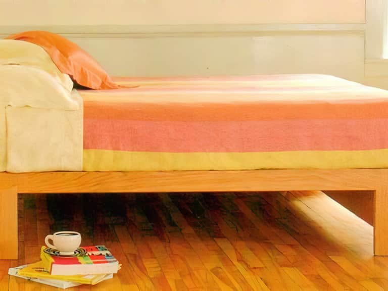
Consider the room as a whole, too. A platform bed frame with a clean silhouette can give textured bedding a clear foundation. For instance, the Maple Corner Woodworks HarvestMoon Dovetail Bed is described as a handcrafted hardwood platform bed with wide slats and a natural hand-rubbed finish. Its simple wood presence could provide a quiet structural counterpoint to patterned or tactile bedding. The wood species and finish options are specified in the product details; the relationship between frame and bedding, however, depends on the room’s colors, proportions, and personal taste.
A practical approach to choosing a combination
When exploring plaid bedding, a chenille coverlet, or leather accents, begin with the sensation and atmosphere you want rather than a checklist of trends. Do you want the bed to feel visually bold, softly textured, or calmly layered? That answer helps determine which material should dominate.
- Choose the anchor. Decide whether pattern, color, or surface will lead. Plaid often leads through pattern; chenille through its tactile depth; a rich solid color through both hue and scale.
- Limit the palette. Select a few related shades and let them repeat across the bedding and room. Repetition can be tonal rather than exact.
- Add contrast deliberately. Use leather or leather-look accents as punctuation, not as a requirement to cover every surface.
- Check the proportions. Look at the full bed from the doorway. If the eye has nowhere to rest, remove a pillow or simplify a layer.
- Confirm care and composition. Review material descriptions and labels, particularly when sets include different textile and accent materials.
This process can be applied to a coordinated ensemble or to individual pieces collected over time. Starting with one material and adding companions gradually makes it easier to judge whether the room needs more contrast or less. It also reduces the temptation to buy a full range of accents before understanding how the main cover behaves in the space.
Let each material tell part of the story
Western-inspired bedding is at its strongest when it draws on the character of its materials rather than relying on a pile of themed objects. Plaid brings order and movement. Chenille offers softness and a surface that shifts with light. Leather accents introduce a firmer note and a sense of contrast. A restrained palette allows those differences to be seen, while repetition ties them together.
The Wooded River examples make the principle easy to observe: Kinsale Oxford combines wool plaid and faux-leather details; Spearhead Dusk sets chenille against faux leather and authentic leather fringe; and Gallop Claret brings a plush chenille duvet cover together with leather-accented decorative pillows. They are distinct arrangements, yet each uses a small group of textures to create depth without requiring every element in the room to compete for attention.
Ultimately, a layered bed should welcome the body as readily as it attracts the eye. Choose surfaces you enjoy touching, colors that feel at ease in the room, and details that can withstand the routines of daily use. When the layers are balanced, the bed feels less like a display and more like a place to settle in—warm, composed, and quietly full of character.
Frequently asked questions
How can plaid bedding feel balanced rather than busy?
Let plaid lead, then keep most additional layers relatively simple. Repeat one or two colors from the pattern in solid fabrics or small accents, and leave some visual space around the main design.
Can chenille and leather accents work together?
Yes. Their contrasting surfaces can create depth: chenille contributes a soft, raised texture, while leather details provide a smoother visual counterpoint. A limited palette helps the combination feel intentional.
What should I check before caring for a mixed-material bedding set?
Read the care instructions for each component and confirm its material description. Sets may combine different fabrics and accents, which can require different handling. Do not assume the same cleaning method is appropriate for every piece.